Progress List Component
Display multiple progress bars with labels, values, and descriptions
Overview
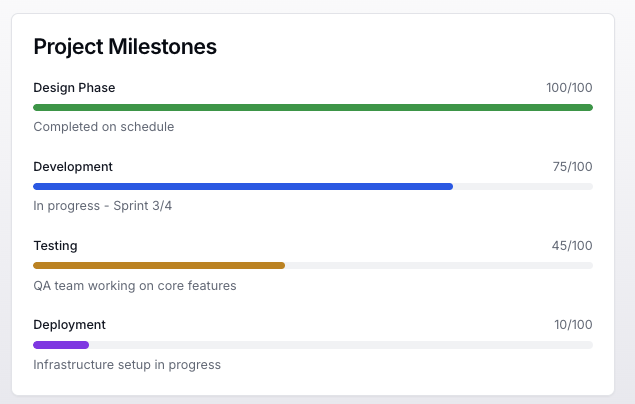
The Progress List component displays a series of progress bars with labels, current values, and optional maximum values and descriptions. Each progress bar can be customized with different colors and includes animated transitions.
Usage
To use the Progress List component in your tool handler, follow these steps:
- Import the
ProgressListUIBuilderandDainResponsefrom the@dainprotocol/utilspackage:
import { ProgressListUIBuilder, DainResponse } from "@dainprotocol/utils";
- Create a ProgressListUIBuilder instance and configure it:
const progressListUI = new ProgressListUIBuilder()
  .title("Project Progress")          // Optional
  .addItems([                         // Mandatory
    {
      label: "Tasks Completed",
      value: 7,
      max: 10,
      color: "bg-blue-600",
      description: "7 out of 10 tasks finished"
    }
  ])
  .build();
- Return the ProgressListUIBuilder instance in a DainResponse object:
return new DainResponse({
  text: "Generated progress indicators",
  data: { /* Your data */ },
  ui: progressListUI
});
Configuration
Mandatory Props
- items (ProgressItem[]): Array of progress items
Optional Props
- title (string): Header title for the progress list
ProgressItem Interface
Each progress item is defined using this interface:
interface ProgressItem {
    label: string;           // Mandatory: item label
    value: number;          // Mandatory: current value
    max?: number;           // Optional: maximum value (defaults to 100)
    color?: string;         // Optional: Tailwind color class
    description?: string;   // Optional: description text
}
Actions
The Progress List supports item selection actions:
progressListUI.onSelectItem({
  tool: "itemViewer",
  params: {
    // Predefined parameters
    view: "details"
  },
  paramSchema: {
    view: { type: "string" }
  }
});
Action Arguments
- tool (string): The name of the tool to be called when an item is selected
- params (object): Pre-defined parameters that will be included with the action:
- These values are set at build time
- Will be passed to the tool when an item is selected
- paramSchema (object): Schema defining required parameters
Examples
Basic Progress List
const basicProgress = new ProgressListUIBuilder()
  .addItems([
    {
      label: "Upload Progress",
      value: 65
    },
    {
      label: "Download Progress",
      value: 30
    }
  ])
  .build();

return new DainResponse({
  text: "Basic Progress",
  data: {},
  ui: basicProgress
});
Progress with Custom Max Values
const taskProgress = new ProgressListUIBuilder()
  .title("Task Completion")
  .addItems([
    {
      label: "Phase 1",
      value: 8,
      max: 10,
      color: "bg-blue-600",
      description: "Initial planning phase"
    },
    {
      label: "Phase 2",
      value: 3,
      max: 12,
      color: "bg-yellow-600",
      description: "Development in progress"
    }
  ])
  .onSelectItem({
    tool: "taskViewer",
    params: {
      type: "phase"
    }
  })
  .build();

return new DainResponse({
  text: "Task Progress",
  data: {},
  ui: taskProgress
});
System Status Progress
const systemStatus = new ProgressListUIBuilder()
  .title("System Status")
  .addItems([
    {
      label: "CPU Usage",
      value: 45,
      color: "bg-blue-600",
      description: "Current processor utilization"
    },
    {
      label: "Storage",
      value: 750,
      max: 1000,
      color: "bg-purple-600",
      description: "GB used out of 1TB total"
    }
  ])
  .onSelectItem({
    tool: "systemMonitor",
    params: {
      detail: "full"
    }
  })
  .build();

return new DainResponse({
  text: "System Status",
  data: {},
  ui: systemStatus
});