Image Gallery Component
Display a responsive grid of images with optional titles and descriptions
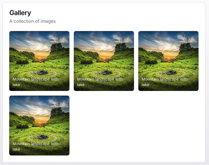
Overview
The Image Gallery component creates a responsive grid of images with customizable columns, hover effects, and optional image titles. Images are displayed in a square aspect ratio with smooth scaling animations on hover.
Usage
To use the Image Gallery component in your tool handler, follow these steps:
- Import the
ImageGalleryUIBuilderandDainResponsefrom the@dainprotocol/utilspackage:
import { ImageGalleryUIBuilder, DainResponse } from "@dainprotocol/utils";
- Create an ImageGalleryUIBuilder instance and configure it:
const galleryUI = new ImageGalleryUIBuilder()
  .title("Product Collection")         // Optional
  .description("Latest releases")      // Optional
  .columns(3)                         // Optional (2, 3, or 4)
  .addImages([                        // Mandatory
    {
      url: "https://example.com/image1.jpg",
      alt: "Product 1",
      title: "Premium Widget"
    },
    {
      url: "https://example.com/image2.jpg",
      alt: "Product 2"
    }
  ])
  .build();
- Return the ImageGalleryUIBuilder instance in a DainResponse object:
return new DainResponse({
  text: "Generated image gallery",
  data: { /* Your data */ },
  ui: galleryUI
});
Configuration
Mandatory Props
- images (GalleryItem[]): Array of image items to display
Optional Props
- title (string): Gallery title
- description (string): Gallery description
- columns (2 | 3 | 4): Number of columns in the grid (default: 3)
GalleryItem Interface
Each gallery item is defined using this interface:
interface GalleryItem {
    url: string;        // Mandatory: image URL
    alt?: string;       // Optional: image alt text
    title?: string;     // Optional: image title overlay
}
Actions
The Image Gallery supports an image click action:
galleryUI.onViewImage({
  tool: "imageViewer",
  params: {
    // Predefined parameters
    source: "gallery"
  }
});
Action Arguments
- tool (string): The name of the tool to be called when an image is clicked
- params (object): Pre-defined parameters that will be included with the action:
- These values are set at build time
- Will be passed to the tool when an image is clicked
- paramSchema (object): Optional schema defining required parameters
Examples
Basic Gallery
const basicGallery = new ImageGalleryUIBuilder()
  .addImages([
    {
      url: "https://example.com/photo1.jpg",
      alt: "Nature scene"
    },
    {
      url: "https://example.com/photo2.jpg",
      alt: "Urban landscape"
    }
  ])
  .build();

return new DainResponse({
  text: "Basic Gallery",
  data: {},
  ui: basicGallery
});
Gallery with Titles and Action
const interactiveGallery = new ImageGalleryUIBuilder()
  .title("Travel Photography")
  .description("Highlights from recent adventures")
  .columns(4)
  .addImages([
    {
      url: "https://example.com/paris.jpg",
      alt: "Eiffel Tower",
      title: "Paris, France"
    },
    {
      url: "https://example.com/tokyo.jpg",
      alt: "Tokyo streets",
      title: "Tokyo, Japan"
    }
  ])
  .onViewImage({
    tool: "photoViewer",
    params: {
      collection: "travel2023"
    }
  })
  .build();

return new DainResponse({
  text: "Travel Gallery",
  data: {},
  ui: interactiveGallery
});
Product Showcase Gallery
const productGallery = new ImageGalleryUIBuilder()
  .title("Spring Collection")
  .description("Latest fashion arrivals")
  .columns(2)
  .addImages([
    {
      url: "https://example.com/product1.jpg",
      alt: "Blue dress",
      title: "Summer Breeze Dress - $89"
    },
    {
      url: "https://example.com/product2.jpg",
      alt: "Leather bag",
      title: "Classic Leather Tote - $129"
    }
  ])
  .onViewImage({
    tool: "productViewer",
    params: {
      category: "spring2024"
    },
    paramSchema: {
      category: { type: "string" }
    }
  })
  .build();

return new DainResponse({
  text: "Product Gallery",
  data: {},
  ui: productGallery
});