Card List Component
Display a grid of cards with titles, descriptions, and icons
Overview
The Card List component displays a responsive grid of cards, each with a title, description, and optional icon. It's ideal for showing features, benefits, steps, or any collection of related items that need visual separation.
Usage
To use the Card List component in your tool handler, follow these steps:
- Import the
CardListUIBuilderandDainResponsefrom the@dainprotocol/utilspackage:
import { CardListUIBuilder, DainResponse } from "@dainprotocol/utils";
- Create a CardListUIBuilder instance and configure it:
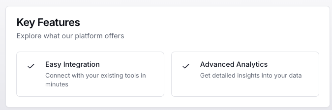
const cardListUI = new CardListUIBuilder()
  .title("Key Features")  // Optional
  .description("Explore what our platform offers")  // Optional
  .addCards([  // Mandatory
    {
      title: "Easy Integration",
      description: "Connect with your existing tools in minutes"
    },
    {
      title: "Advanced Analytics",
      description: "Get detailed insights into your data"
    }
  ])
  .build();
- Return the CardListUIBuilder instance in a DainResponse object:
return new DainResponse({
  text: "Generated card list",
  data: { /* Your data */ },
  ui: cardListUI
});
Configuration
Mandatory Props
- cards (CardItem[]): Array of card items, where each card must have:
- title (string): The card's title
- description (string): The card's description
Optional Props
- title (string): Header title for the entire card list
- description (string): Header description for the card list
- icon (string): Icon identifier for individual cards
CardItem Interface
The CardItem interface defines the structure of each card in the list:
interface CardItem {
    title: string;
    description: string;
    icon?: string;
}
Actions
The Card List component supports an onConfirm action that can be triggered for card interactions:
cardListUI.onConfirm({
  tool: "yourToolName",
  params: {
    // Predefined parameters
    action: "value"
  }
});
Action Arguments
-
tool (string): The name of the tool to be called when a card action is triggered.
-
params (object): Pre-defined parameters that will be included with the tool call:
- These values are set at build time
- Will be combined with the card's data when triggered
Examples
Basic Card List
const basicList = new CardListUIBuilder()
  .addCards([
    {
      title: "Automated Backups",
      description: "Your data is automatically backed up every hour"
    },
    {
      title: "24/7 Support",
      description: "Get help whenever you need it from our support team"
    }
  ])
  .build();

return new DainResponse({
  text: "Basic Card List",
  data: {},
  ui: basicList
});
Card List with Header and Action
const actionList = new CardListUIBuilder()
  .title("Getting Started")
  .description("Follow these steps to set up your account")
  .addCards([
    {
      title: "Create Account",
      description: "Sign up using your email address"
    },
    {
      title: "Configure Settings",
      description: "Customize your workspace preferences"
    }
  ])
  .onConfirm({
    tool: "onboarding",
    params: {
      flow: "setup"
    }
  })
  .build();

return new DainResponse({
  text: "Action Card List",
  data: {},
  ui: actionList
});
Feature List with Icons
const featureList = new CardListUIBuilder()
  .title("Platform Benefits")
  .description("Why customers choose our solution")
  .addCards([
    {
      title: "Security First",
      description: "Enterprise-grade security with end-to-end encryption",
      icon: "shield"
    },
    {
      title: "Scalable",
      description: "Grows with your business needs",
      icon: "scale"
    }
  ])
  .build();

return new DainResponse({
  text: "Feature List",
  data: {},
  ui: featureList
});