Card Component
Display content in a contained card layout with optional title, fields, and custom actions
Overview
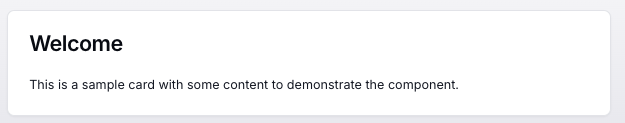
The Card component provides a simple, clean container for content with an optional title. It supports different styling variants, buttons, and other fields. You can also trigger tool calls via custom button actions.
Table of Contents
Usage
To use the Card component in your tool handler:
- First, import the required components:
import { CardUIBuilder, DainResponse } from "@dainprotocol/utils";
- Create and configure your card:
const cardUI = new CardUIBuilder()
  .title("Important Information")    // Optional
  .content("This is the main content of the card") // Optional but recommended
  .build();

return new DainResponse({
  text: "Generated card content",
  data: { /* Your data */ },
  ui: cardUI
});
Configuration
Card Props
| Name | Type | Description | Required? | Default |
|---|---|---|---|---|
| title | string | The heading or title to display at the top of the card. | No | "" |
| content | string | The main content text of the card. | Yes | "" |
| variant | "default" | "destructive" | "outline" | Styling variant for the card. | No | "default" |
| buttonText | string | (Retro-compat) Deprecated in favor of .addButton(). | No | "" |
| buttonUrl | string | (Retro-compat) Deprecated in favor of .addButton() with link. | No | "" |
| fields | CardField[] | Additional fields (label-value pairs) to display in the card. | No | [] |
| actionAlignment | "row" | "column" | How to align actions/buttons in the card. | No | "row" |
CardField Interface
export interface CardField {
  label: string;        // Label text (e.g. "User ID")
  value: string;        // Value text (e.g. "12345")
  type?: "link" | "button"; // Optional: can display as a link or button
  link?: string;        // If 'type' is "link", provide a URL
}
Fields
Note: Fields can be added using several methods, giving you flexibility in how you structure your card's content.
You can add fields using these methods:
.addField(field: CardField): Add a single field.addFields(fields: CardField[]): Add multiple fields at once.addFields(items: T[], mapper: (item: T) => CardField): Add multiple fields using a mapping function
Example:
const cardUI = new CardUIBuilder()
  .title("Order Details")
  .content("Here are the details of your recent purchase.")
  .addField({ label: "Order ID", value: "12345" })
  .addField({ label: "Status", value: "Shipped" })
  .build();
Actions
Retro Compatibility: onConfirm
Warning: While still supported, onConfirm is considered legacy. Consider using the new button methods for more flexibility.
cardUI.onConfirm({
  tool: "yourToolName",
  paramSchema: {
    param1: { type: "string" }
  },
  params: {
    preset: "value"
  }
});
New Methods: addButton, addButtons
For more flexible actions, we provide several button-related methods:
addButton
export interface ButtonParams {
  label: string; // The text displayed on the button
  tool: string;  // The name of the tool to call
  paramSchema: paramSchema;  // Tool parameters
  params: Record<string, unknown>; // Predefined values
  variant?: ButtonVariant; // "primary" | "secondary" | "destructive" | "cancel" | "outline"
}
Example:
const cardUI = new CardUIBuilder()
  .title("Manage Account")
  .content("Choose an action to perform on your account")
  .addButton({
    label: "Delete Account",
    tool: "accountManager",
    paramSchema: {
      userId: { type: "string" },
      reason: { type: "string" }
    },
    params: {
      action: "delete",
      timestamp: Date.now()
    },
    variant: "destructive"
  })
  .build();
addButtons
You can add multiple buttons either as an array or using a mapper function:
Array Method:
const cardUI = new CardUIBuilder()
  .title("Account Actions")
  .content("Choose one of the following options")
  .addButtons([
    {
      label: "Suspend",
      tool: "accountManager",
      paramSchema: { userId: { type: "string" } },
      params: { action: "suspend" },
      variant: "secondary"
    },
    {
      label: "Delete",
      tool: "accountManager",
      paramSchema: { userId: { type: "string" } },
      params: { action: "delete" },
      variant: "destructive"
    }
  ])
  .build();
Mapper Method:
const actions = [
  { actionName: "suspend", label: "Suspend", variant: "secondary" },
  { actionName: "delete", label: "Delete", variant: "destructive" }
];

const cardUI = new CardUIBuilder()
  .title("Dynamic Actions")
  .content("These actions are generated from data")
  .addButtons(actions, (item) => ({
    label: item.label,
    tool: "accountManager",
    paramSchema: { userId: { type: "string" } },
    params: { action: item.actionName },
    variant: item.variant
  }))
  .build();
Aligning Actions
Use alignActions to control button layout:
const cardUI = new CardUIBuilder()
  .title("Actions Layout")
  .content("These buttons will be aligned horizontally")
  .alignActions("row")
  .addButton({
    label: "Action 1",
    tool: "sampleTool",
    paramSchema: {},
    params: {}
  })
  .addButton({
    label: "Action 2",
    tool: "sampleTool",
    paramSchema: {},
    params: {}
  })
  .build();
Examples
Note: Here are complete examples showcasing different card configurations.
Basic Card
const basicCard = new CardUIBuilder()
  .content("This is a simple card with just content.")
  .build();

return new DainResponse({
  text: "Basic Card",
  data: {},
  ui: basicCard
});
Card with Title, Variant, and Aligned Actions
const warningCard = new CardUIBuilder()
  .title("Subscription Warning")
  .content("Your subscription will expire soon.")
  .variant("destructive")
  .alignActions("row")
  .addButton({
    label: "Renew Now",
    tool: "subscriptionTool",
    paramSchema: { userId: { type: "string" } },
    params: { action: "renew" },
    variant: "primary"
  })
  .build();

return new DainResponse({
  text: "Warning Card",
  data: {},
  ui: warningCard
});
Card with Fields
const detailsCard = new CardUIBuilder()
  .title("Order Details")
  .content("Below are the details for your order.")
  .addFields([
    { label: "Order ID", value: "12345" },
    { label: "Status", value: "Shipped" }
  ])
  .build();

return new DainResponse({
  text: "Order Details Card",
  data: {},
  ui: detailsCard
});
Card with Multiple Buttons
const multiButtonCard = new CardUIBuilder()
  .title("Manage Profile")
  .content("Pick an action to perform on your profile.")
  .addButtons([
    {
      label: "Update Info",
      tool: "profileTool",
      paramSchema: { userId: { type: "string" } },
      params: { action: "update" },
      variant: "secondary"
    },
    {
      label: "Delete Profile",
      tool: "profileTool",
      paramSchema: { userId: { type: "string" } },
      params: { action: "delete" },
      variant: "destructive"
    }
  ])
  .build();

return new DainResponse({
  text: "Multi-Button Card",
  data: {},
  ui: multiButtonCard
});
Retro-Compatible Card with onConfirm
const retroCard = new CardUIBuilder()
  .title("Delete Account")
  .content("Are you sure you want to delete your account?")
  .onConfirm({
    tool: "accountManager",
    paramSchema: {
      userId: { type: "string" },
      reason: { type: "string" }
    },
    params: {
      action: "delete",
      timestamp: Date.now()
    }
  })
  .build();

return new DainResponse({
  text: "Retro-Confirm Card",
  data: {},
  ui: retroCard
});